Oh, but I rather liked Officer Printype! He had such a fine costume... I also rather liked the green Olivers, black being a rather common hue for typewriters.
This looks like a nice Oliver, and thanks for the detailed review and explanations on how this differs from the earlier models. The ribbon reverse sounds mighty convenient, I must say. I am still nervous about the noise, but I think the sheer pleasure of watching the Oliver at work makes up for it... I look forward to having one of these one day!
Perhaps I should retract what I said about Officer Printype and the green color after reading your comment. Oliver-green does give the machine a distinction others don't have.
I was just playing with my Oliver 9 the other day. I think I really need to give the typeslugs a good cleaning, as my biggest issue is uneven letters on the page. I suppose that could be a platen issue or even a U-bar alignment issue, but I'll go with the cleaning first!
Deek, you might also try adjusting the third wheel in the back of the carriage which the carriage rides on. There's a a nut there that's easily accessible and can be loosened. Try loosening the nut and raising the back of the carriage up or down on that wheel.


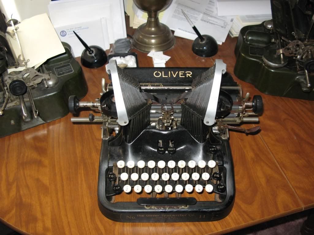
Oh, but I rather liked Officer Printype! He had such a fine costume... I also rather liked the green Olivers, black being a rather common hue for typewriters.
ReplyDeleteThis looks like a nice Oliver, and thanks for the detailed review and explanations on how this differs from the earlier models. The ribbon reverse sounds mighty convenient, I must say. I am still nervous about the noise, but I think the sheer pleasure of watching the Oliver at work makes up for it... I look forward to having one of these one day!
Perhaps I should retract what I said about Officer Printype and the green color after reading your comment. Oliver-green does give the machine a distinction others don't have.
DeleteI was just playing with my Oliver 9 the other day. I think I really need to give the typeslugs a good cleaning, as my biggest issue is uneven letters on the page. I suppose that could be a platen issue or even a U-bar alignment issue, but I'll go with the cleaning first!
ReplyDeleteDeek, you might also try adjusting the third wheel in the back of the carriage which the carriage rides on. There's a a nut there that's easily accessible and can be loosened. Try loosening the nut and raising the back of the carriage up or down on that wheel.
Delete